The Problem
Every product speaks a different language
When I joined Glasswall in 2021, there was no UX function, shared component library, or consistent way to talk about what the products did. Halo, Meteor, and the Embedded Engine had each grown from separate engineering efforts and were incoherent as a portfolio. The public site and documentation site were also uniquely styled and added to the brand inconsistency.
Prospects had a difficult time understanding the value of our products, and sales and support teams spent enormous energy bridging the gap between technical capability and customer understanding. The documentation was dense and product-centric; it described what the software could do, not what users wanted to accomplish.
“They couldn’t understand the concepts until we put an interface on it. Once they could see it, they could see how it met the needs of their own company.”
My Role
Building the function and deliverables
I was hired to build UX from scratch. My first moves were structural: introduce Figma as the company’s design tool, establish a weekly cross-functional alignment meeting, set up design reviews, and hire the people who would help me do this work at scale. I managed four people directly including designers, a technical writer, and a product marketing partner, and led a cross-functional team of seven across engineering, product, and QA.
I also served on the Senior Management Team, which meant design had a seat at the table for company-wide product decisions. I spent a lot of early time making developers serve as active participants in the design system, not just downstream of it, and Engineering later said Figma “revolutionized their work.”
The Approach
One design language across everything
The design system grew iteratively over four years, from early wireframes to a full component library with dark styling covering roughly 100 screens across three products. But the visual system was only part of the story.
I worked closely with the Marketing Director to establish a shared content language for Glasswall, settling on terms that made sense to customers and making sure those terms appeared consistently everywhere someone encountered the brand. Different products had been using different words for the same concepts. That inconsistency eroded trust and led to confusion.
The language style guide we created was adopted company-wide by design, engineering, and product. It made writing faster and the product’s value more apparent to users, prospects, and enterprise buyers who were evaluating whether to trust the company with serious security infrastructure.
The Thinking Behind the Work
How we approached UX at Glasswall
A 3-minute overview of the UX thinking behind Glasswall’s product suite.
The Products
The design language in practice
Halo was designed from scratch with no prior UI to inherit. The dark-theme visual identity, component system, and navigation structure were built together, with the documentation site echoing the same language and visual approach.
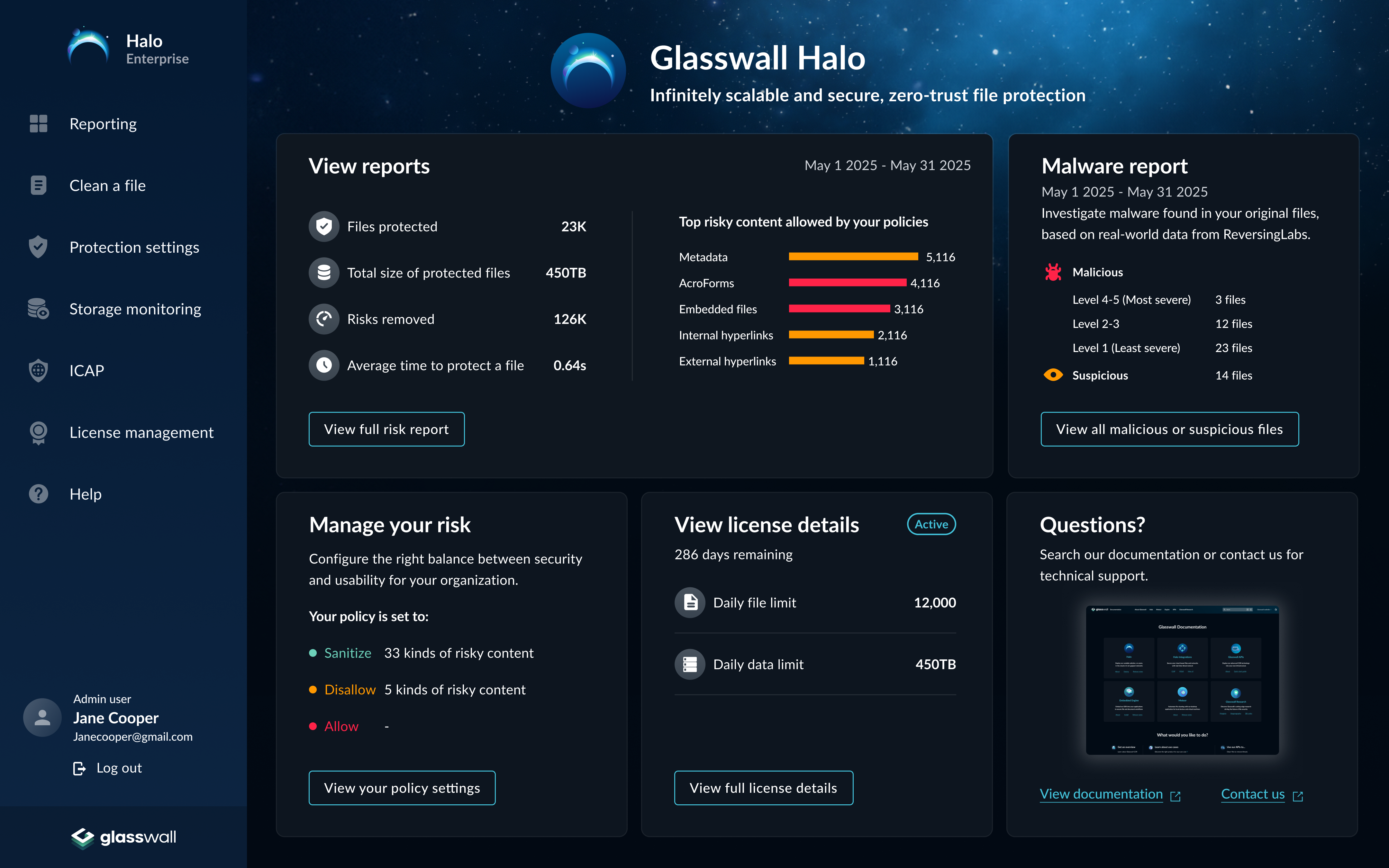
Halo, designed from the ground up as part of the unified design language
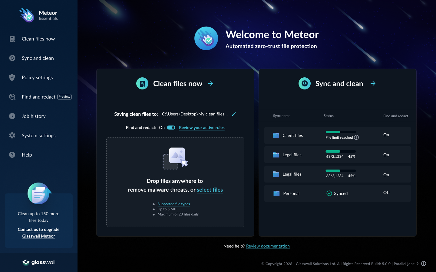
Meteor had an existing UI when I joined, functional but built without a design system. The redesign brought it into the unified visual language with consistent navigation, shared components, and terminology aligned with the rest of the portfolio.

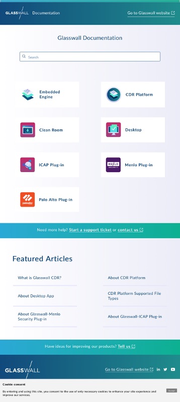
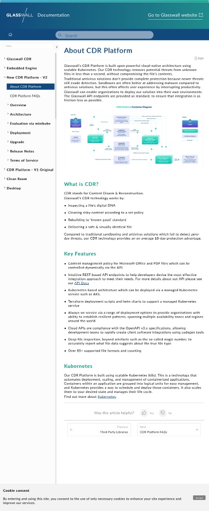
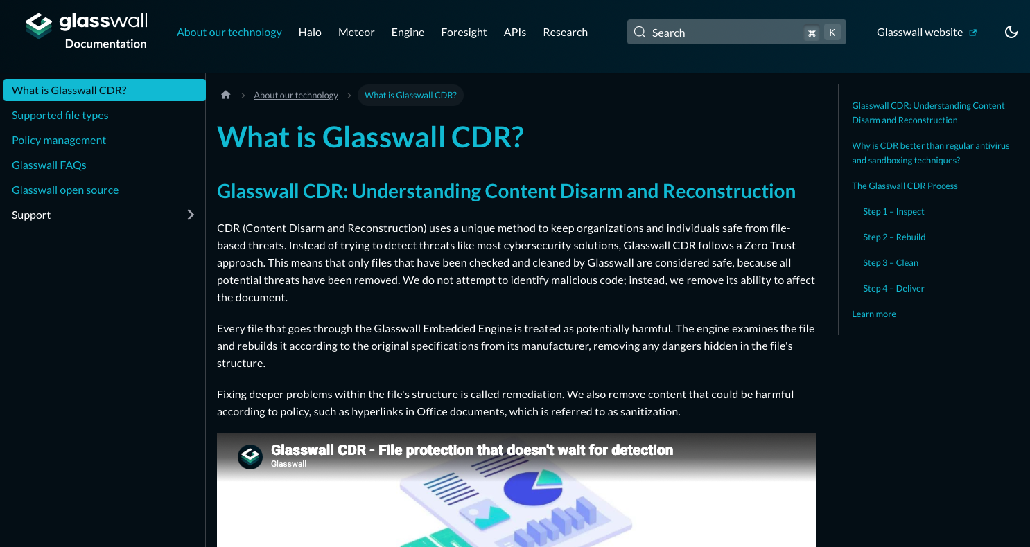
Documentation
The documentation site: same language, new structure
The documentation migration reoriented content around users instead of the product. The old site organized articles around what the software could do. The new site organized them around what users needed to accomplish. The redesigned site matched the product visual language and let customers self-serve more effectively, giving sales and support teams documentation they could actually point prospects to.

What Changed
Design as a business driver
The unified design language contributed directly to enterprise and government contracts with partners including Microsoft, Oracle, NSA, Northrop Grumman, and BAE Systems. The Halo product won Security Innovation of the Year at the UK IT Industry Awards in 2024. Internally, shared components and aligned terminology reduced design-development churn and made the whole organization faster.
Reflection
Systems thinking is a leadership skill
The most important decisions I made weren’t about which shade of teal to use. They were about relationships: making sure stakeholders were included along the way so there were no surprises at launch, and making engineers feel like participants rather than implementors. That investment paid off in unexpected ways. Engineers often brought implementation ideas that were just as usable for customers but faster and cheaper to build - the kind of creative problem-solving that only happens when people feel genuine ownership over the work.
A design system holds together because the people around it want it to. Getting there requires more listening than designing.