The Problem
Data without context
When we started designing the Halo portal, we made a strategic decision to design the reporting dashboard first. Glasswall's technology was impressive, processing hundreds of thousands of files and removing threats in under a second, but none of that value was obvious to the people who needed to see it.
Security administrators needed to understand what was happening in their environment and take action on it, and CISOs and buyers needed to justify the investment to their organizations. The reporting dashboard had to work for both: operationally useful for the people living in it every day, and compelling enough to make the case for renewal.
“A big gap is invisibility -- there are no tools that give you visibility of actions and the teams that are meant to own this.” -- Discovery interview participant
Designing the data layer first also had a practical benefit: it gave engineering the architecture they needed so that when it came time to link data with user actions, everything would be in place. Getting the data model right early prevented a lot of rework later.
Discovery Research
Starting with what users actually needed to know
Before sketching anything, I ran discovery interviews with security professionals to understand what visibility meant to them, what decisions they needed to make, and what data they were missing.
The clearest theme: security engineers weren't just looking for data; they were looking for data they could act on and share. They needed to convey risk to stakeholders, justify policy decisions, and make the case for their tools.

Discovery interview highlights, August 2022. Key themes shaped the entire dashboard strategy.
Strategy
Actionable data as a design philosophy
With research in hand, I worked with the Product Manager and UX Designer to define the goals for the dashboard and translate them into design principles. We laid out the problem, documented our assumptions and open questions, and brought the development team in early for high-level planning.
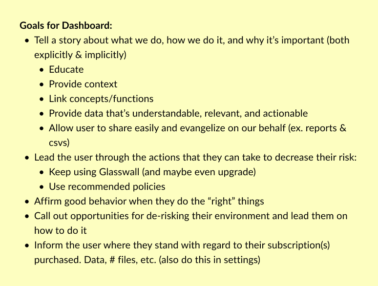
Dashboard goals
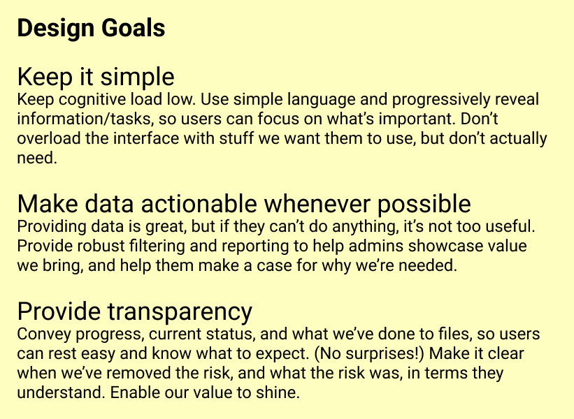
Design principles
We also defined key user tasks (the specific jobs the dashboard needed to support) and used those as our design criteria throughout.
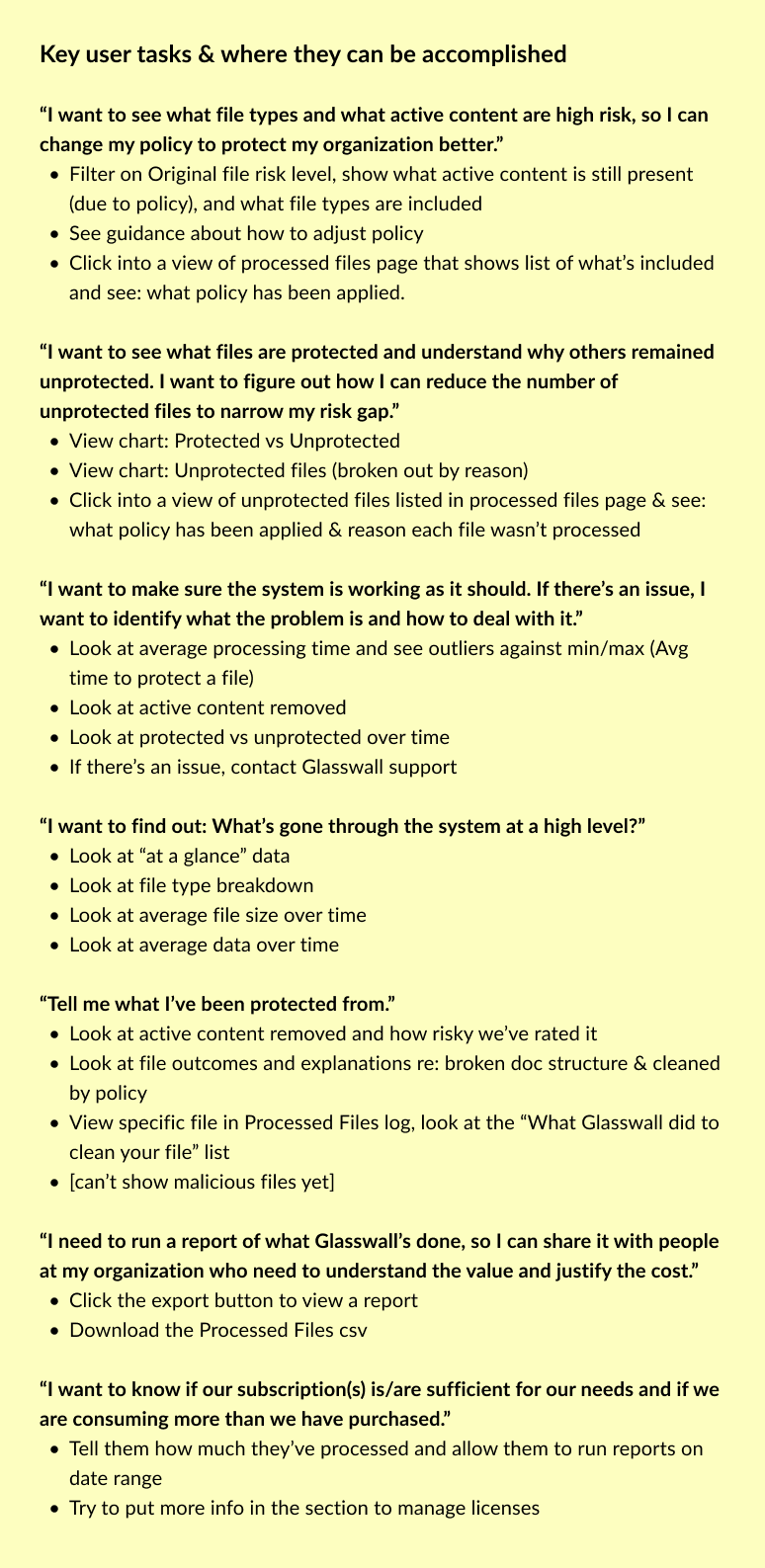
Key user tasks defined before any wireframing began, our north star throughout the project.
The Process
From rough sketches to tested designs
The design process was deliberately iterative. We started with rough wireframes to explore the structure and information hierarchy, refined through two wireframe versions with the team, tested with users, and then moved to high-fidelity design and sprint stories.
Problem statement, assumptions, open questions. Brought PM and development into the framing before any design work started.
Rough sketches to explore structure, then two rounds of refined wireframes reviewed with the cross-functional team.
Usability testing on wireframes, then high-fidelity design and sprint stories to get into the development pipeline.
The rough wireframe was intentionally messy; it was a thinking tool, not a deliverable. The goal was to get the content structure and tab logic in front of the team early enough that everyone could weigh in before anything was precious.
First rough wireframe: content and structure only, no visual design. The goal was alignment, not polish.
The second wireframe round added real specificity: three tabs (Risk summary, Risk details, Data and processing), defined chart types, and the progressive disclosure logic that let users start at a high level and drill into the data they needed.
Tab 1 -- Risk summary

Tab 2 -- Risk details
Tab 3 -- Data and processing
The Final Design
Security data that tells a story
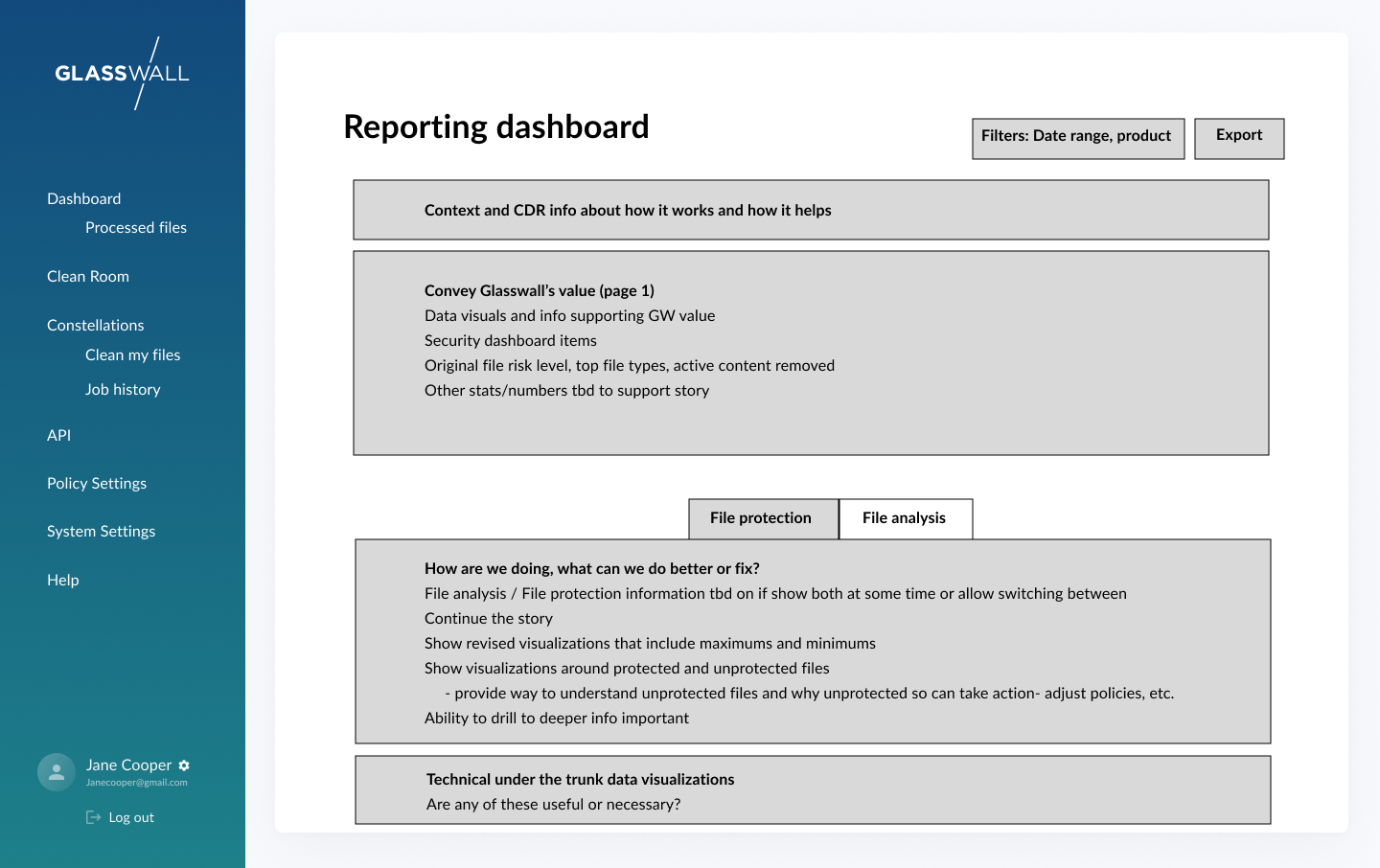
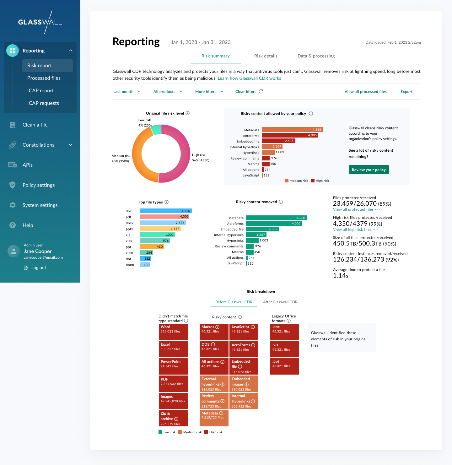
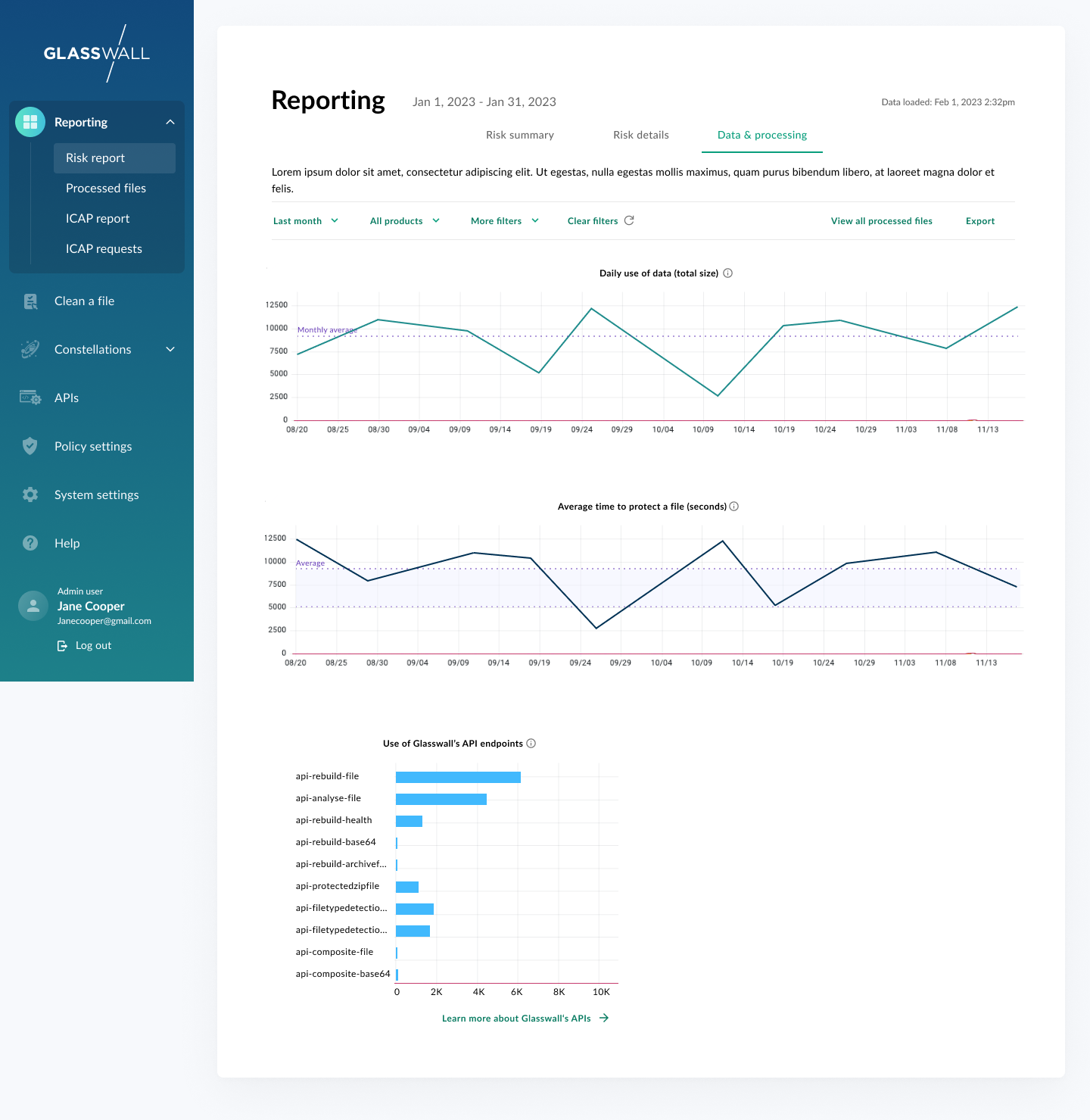
The final dashboard delivered on all three design principles. The Risk summary tab gives users an immediate, scannable view of what Glasswall has done (files protected, risks removed, average processing time). From there, users can drill into risk details, see trend lines over time, filter by product or date range, and export reports to share with leadership.
Every data point links to an action. A chart showing unprotected files links to the processed files log. A risk summary panel links to policy settings.

Final design: the full reporting dashboard showing risk overview, risk analysis, structural repair, and trend data.
Reflection
Data first, design second
The decision to start with the reporting dashboard rather than other portal features was the right call. It forced us to agree on what data mattered before we designed anything around it, and it gave engineering a clear data architecture to build toward. By the time we got to high-fidelity design, there were no open questions about what the system could actually surface.
The bigger lesson was about the dual audience. A dashboard that only works for admins is a monitoring tool. A dashboard that also works for buyers is a business case. Designing for both audiences at once, without overloading either, required constant prioritization. The question we kept asking was: if a CISO saw this for the first time, would they understand the value? And if a sysadmin used this every day, would it actually help them do their job? When the answer to both was yes, we knew we had it right.