The Problem
Requiring complex documentation to configure simple settings
Glasswall’s core technology sanitizes files by removing active content like macros, embedded scripts, and acroforms according to an organization’s risk appetite. That configurability was a key differentiator, but users weren’t able to understand and control it easily.
When we first started building the admin settings area in Halo, the options were essentially a direct translation of the underlying API parameters. The labels had been created by engineers and didn’t have enough context to convey what they meant or what the best option was.
Our users ranged from seasoned security engineers who knew exactly what a Dynamic Data Exchange object was, to IT admins at small organizations who were responsible for file security without any background in it. A settings page that worked for one group alienated the other. We needed to design for both without condescending to either.
The goal was also practical: users shouldn’t have to open a support ticket, read the documentation site, or call an engineer just to change a setting.
Content Strategy
Starting with a content audit
Before we touched any UI design, I knew we had a content problem. The first step was to inventory every piece of active content that Glasswall processed across all the file types we supported and figure out what it actually was, what risk it represented, and what should happen to it by default.
A lot of that work happened in a messy working document that was more conversation than spec. We were asking questions like: what does “Actions all” mean to someone who’s never read the PDF standard? What’s the difference between blocking a file and sanitizing it? And when two options are equally secure but one is more usable, which do we recommend?
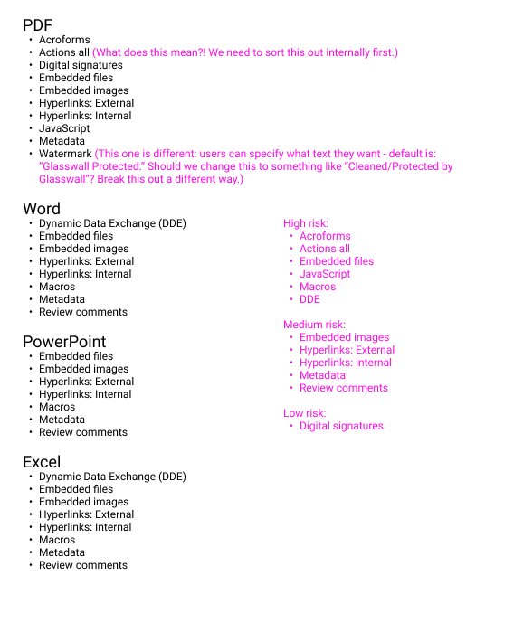
Content inventory: mapping every active content type, its risk level, and our early questions.
Content Strategy
Aligning language
One of the thorniest problems was labeling the three possible policy actions. The Engine and API used Sanitise, Disallow, and Allow. “Sanitise” was British English, “Disallow” meant nothing to most people, and even after explaining what each one did, the distinctions between them weren’t intuitive.
We spent real time exploring alternatives, working through dozens of combinations before landing on language that was accurate, plain, and scalable. The goal wasn’t to dumb things down; it was to make the choices clear enough that users felt confident rather than anxious when they changed something.
We eventually landed on Sanitize, Block, and Allow, language that communicated the outcome without requiring a security background to understand. “Sanitize” became the recommended default, framed as the choice that balances usability and security.
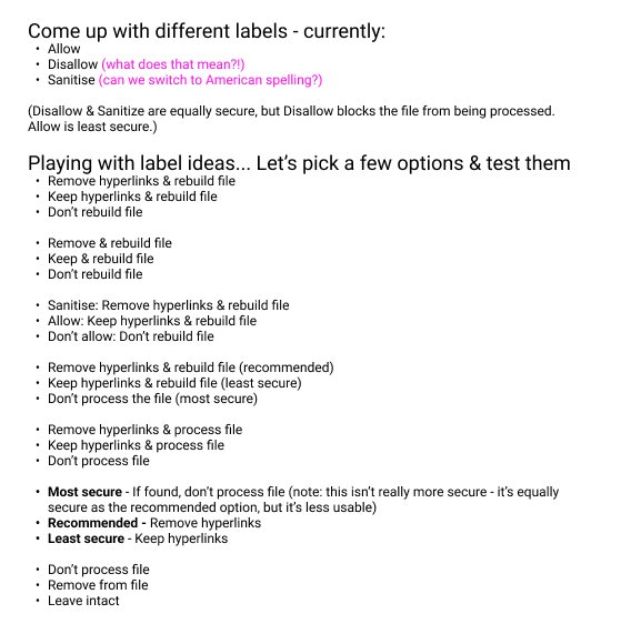
Label exploration: working through the language to find options that were plain and accurate.
Research
Designing for the person who just wants it to work
The policy settings had to work across a wide spectrum of users. At one end: security engineers who wanted precise control and would read every tooltip. At the other: IT generalists at smaller organizations who needed to set things up correctly once and trust they didn’t need to revisit them.
We mapped out the key journeys for each: first-time setup, where defaults needed to be genuinely good rather than just safe; ongoing management, where a repeat user might want to tweak a single setting without disrupting everything else; and power user configuration, where the system needed to support custom policies and saved presets down the line.
These weren’t formal research deliverables; they were working tools that kept us honest. When we were tempted to expose more configuration options, we came back to the non-technical persona and asked whether they’d know what to do.

Lightweight personas and key journeys kept the design grounded in how different users would actually encounter the settings.
Design Process
From flat list to structured choice
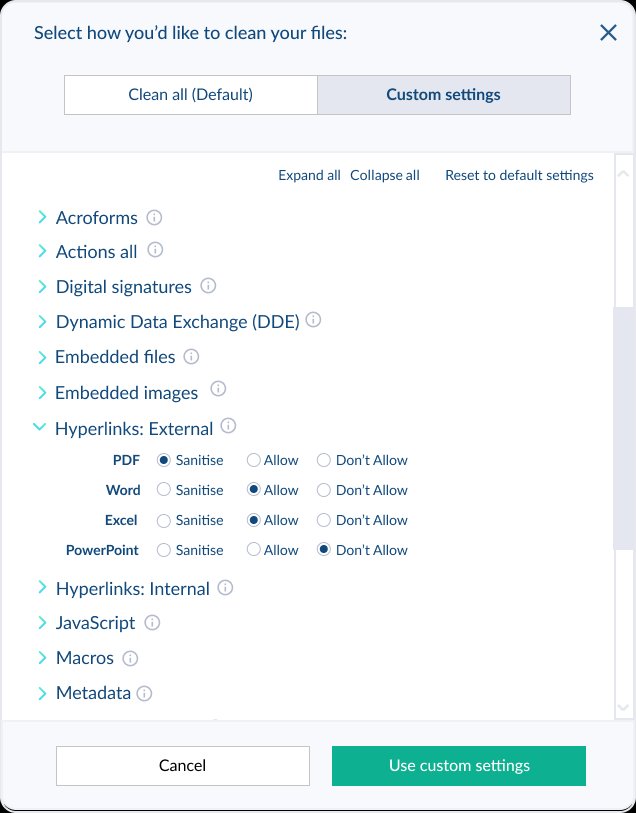
Early wireframes established the core structure: a toggle between default settings and custom configuration, with each content type as an expandable row. The accordion pattern was a deliberate choice, as it let users see everything at a glance without being overwhelmed by all the options at once.
The first functional concept was rough but proved the model. Expanding a row would reveal per-file-type controls for that content type, allowing a security admin to set different policies for PDFs versus Word documents if their threat model called for it. That granularity was important to technical users, but we made sure it didn’t surface unless someone wanted it.
The first wireframe concept: an accordion layout with a clean default and a custom mode.
Design Process
Adding the risk layer
The wireframe established the structure. The next challenge was making the risk level legible at a glance without turning the interface into a warning label. We added a three-column header to the radio button controls that communicated the security posture of each option so that the meaning of a choice was visible before the user made it.
We also added plain-language descriptions for every content type that explained what the thing was and why it mattered. An acroform wasn’t just a name anymore; it was “a form that may also contain active code, such as JavaScript, which could be malicious.”
“The goal wasn’t to replace the documentation site—it was to make the documentation site unnecessary.”

The refined design introduced plain-language descriptions for every content type and a risk-level header on the controls.
Final Design
A settings page that explains itself
The final high-fidelity design brought everything together in the Halo visual language. The policy settings page sat within a tabbed Protection settings area alongside Threat prediction and Validation settings, a structure designed to grow as we added capabilities without requiring a redesign of the whole section.
Risk indicators beside each content type gave users a visual signal before they read anything. The three-column header was color-coded: green for the recommended option, amber for blocking, red for allowing. Defaults were set to Sanitize across the board, and a “Restore to recommended” button made it easy to get back to a safe state after experimenting.
We also handled edge cases like irregular PDF processing, where the right choice depended on a user’s tolerance for extended processing time. Rather than hiding that complexity, we surfaced it with a card selection pattern that explained each option’s trade-offs before the user committed.

The final design: a self-explaining settings page that scales across user types, with risk made visible at every level of the hierarchy.
Outcome & Evolution
Built to grow
One of the design goals from the start was that the settings architecture needed to scale. Glasswall was adding new capabilities regularly, and the last thing we wanted was a pattern that required a full redesign every time a new content type or integration appeared.
The tabbed Protection settings structure proved its value over time. As we added M365 integration (monitoring for Outlook, OneDrive, and SharePoint), the integration settings could live alongside policy settings without fighting for space or disrupting the mental model users already had. New content types could be added to the accordion as rows; new setting categories could be added as tabs.
The deeper lesson from this project was about the relationship between content and design. Getting the language right first made every subsequent design decision easier. When the words were precise, the layout could follow naturally.