The Project
A program growing faster than its tools
The Remote Cardiovascular Health program at Mass General Brigham targeted patients with elevated cholesterol and hypertension, helping them reach goal levels through a combination of phone-based care navigation and algorithmic medication dosing. Patients improved their health outcomes while significantly reducing office visits. The model was working, and it was growing fast.
The problem was the system holding it all together. Navigators were juggling CardioCompass (a custom data-capture tool), Epic (the hospital’s EHR), Tableau, and several manual spreadsheets to manage patients through their care journey. Systems didn't talk to each other, keeping records consistent meant constant copying and pasting, and training new navigators took weeks.
As enrollment grew by hundreds of patients a month, the team knew the current setup wouldn’t scale. The goal was a full redesign on Microsoft Dynamics 365, a platform flexible enough to support workflow automation, Epic integration, and task management.
Research
26 participants, 99 pain points
Before touching design, we ran a full round of qualitative research. Between April and June 2020, we job-shadowed and interviewed 26 participants across every role in the program: enrollers, titrators, pharmacists, program administrators, physicians, downstream PCPs, and one patient who had completed the program.
The research sessions were structured so that at least two team members were present for each (one to observe and ask questions, one to take notes), and findings were compiled and analyzed as a group. We catalogued 99 discrete pain points and grouped them by theme.
Nearly half of all pain points came back to how much time was wasted keeping two systems in sync. Navigators were copying medication data between CardioCompass and Epic by hand, then triple-checking it because inconsistencies were common, and some of those inconsistencies were patient safety issues. Work queues were long and hard to parse. Each task required far too many clicks.
The usability issues compounded things. There was no way to get a quick summary of a patient’s history and next steps without opening a chain of activities one by one. Information was laid out for data entry, not for decision-making. The system had been built to capture data, not to guide care.
“There’s tons of flipping back and forth between Epic and CardioCompass, especially for patient-building and screening. I triple check everything, so I’m always going back and forth.”
Communication was another major theme. Calling patients often led to phone tag, and there were no alternatives built into the system. When navigators wanted to leave notes for colleagues, they used activity fields that weren’t designed for that purpose and didn’t surface them in any useful way.
We also heard something important in the other direction: the program was valued. Staff, physicians, and patients believed in what it was doing. The work was meaningful; the system was just getting in the way.
Journey Mapping
Mapping the work before designing the tool
With the research findings in hand, we built user journeys for five of the roles most central to the day-to-day operation of the program, including Enrollment Navigator and Patient. These journeys mapped what people were doing, phase by phase, with their goals, actions, and opportunities for improvement.
The Enrollment Navigator journey captured a full day of call prep, enrollment calls, post-call tasks, and other duties. The biggest time sinks were visible immediately: documentation overhead, the need to manually import patient data from Epic, and the time spent on Epic documentation at the end of every call. The opportunities column pointed directly toward what the new system needed to automate.
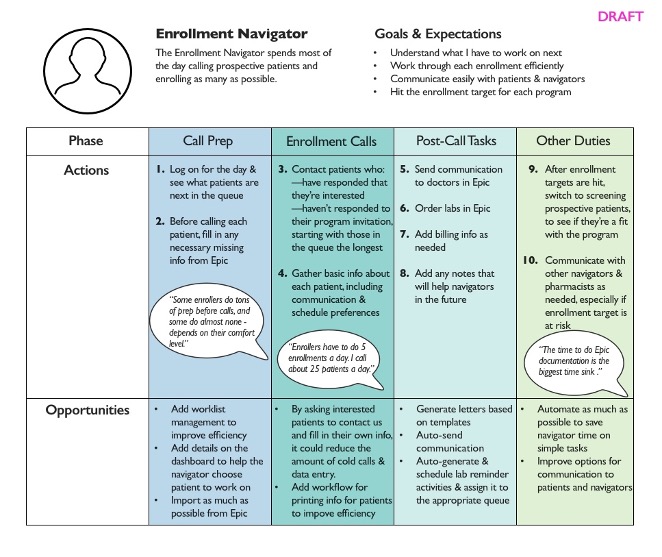
Enrollment Navigator journey map: call prep through post-call tasks, with improvement opportunities surfaced at each phase.
Journey Mapping
The patient’s side of the experience
We mapped the Patient journey from initial identification through enrollment, device setup, monitoring, and long-term maintenance. This was important because the new system needed to support automated communication with patients, and that communication had to make sense from where the patient was in their care journey, not just from where the navigator was in their workflow.
A key insight from the patient journey: patients needed to know when to take action and how to do it without having to call the program. That meant timely, clear communication sent at the right moment.

Patient journey map: from enrollment through long-term maintenance, surfacing where the right communication could reduce friction and keep patients on track.
Workflow Design
Mapping every branch before building anything
One of the most important and most underestimated pieces of the redesign was the workflow documentation. Because the new system needed to automate communications and guide navigators through clinical tasks, every decision point in the care pathway had to be mapped explicitly. What happens when a patient doesn’t respond to a text within three days? What happens if labs come back from a external lab versus an internal lab?
The full hypertension workflow was complex enough that mapping it end-to-end produced something that looked more like a circuit diagram than a flowchart. We also produced detailed views of specific paths so we could show what needed to happen for a particular part of the journey, in what sequence, with what fallback logic, so that the development team had a clear specification.
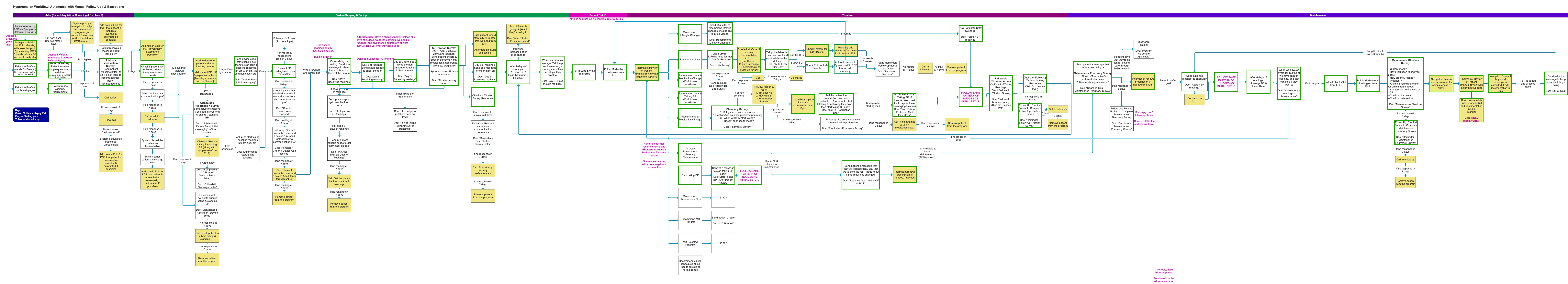
The complete hypertension workflow: every decision point, patient state, and automated action from enrollment through maintenance.
Workflow Design
Specifying the logic, not just the flow
Working at this level of detail mattered for reasons beyond development handoff. The process of mapping the workflows surfaced disagreements and ambiguities in the clinical protocols themselves. Those needed to be resolved before the system could be built, and the workflow diagrams became the medium for those conversations.
They also shaped the automated message templates. Because each message was tied to a specific point in a specific workflow path, we could be precise about what the patient knew at that moment, what they were being asked to do, and what would happen next. That grounding made the templates much easier to write clearly.
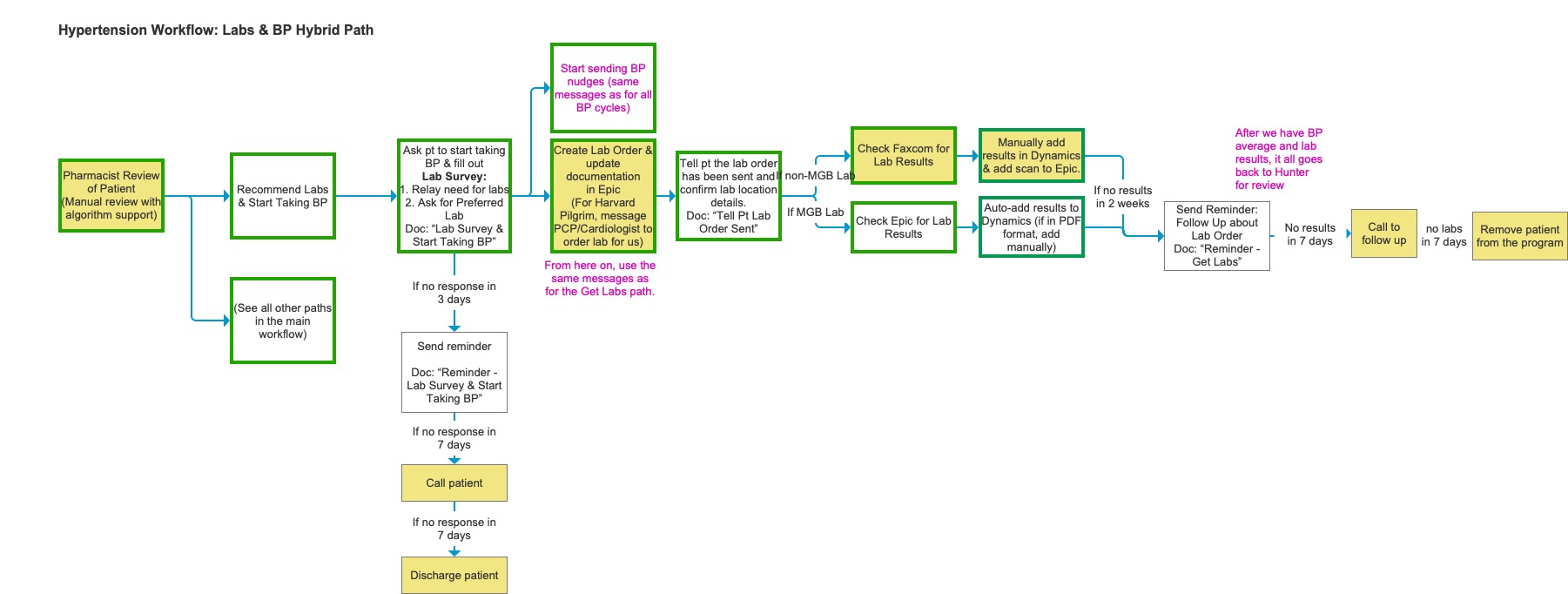
The Labs & BP Hybrid Path in detail: step-by-step logic for lab ordering, patient follow-up, and result handling across MGB and non-MGB labs.
Content Strategy
Writing messages the system could send on its own (almost)
One of the most consequential parts of the project was developing the message template library. Ideally, the new system would send texts and emails to patients automatically, based on where they were in their care journey, like reminders to take BP readings, prompts to schedule labs, and follow-ups when there was no response. Because this was a pilot and we needed to take great care with health and safety, these messages still needed a navigator to approve them, but the goal was to treat them as if the system was sending them automatically.
That put enormous pressure on the writing. Every message had to be plain enough for patients who weren’t medically literate, specific enough to be actionable, and delivered at exactly the right moment in the workflow. A reminder that arrived before the patient had set up their BP cuff was useless. A follow-up that assumed the patient had already done a lab they hadn’t been asked to do yet could cause real confusion.
All templates were written in both English and Spanish, with attention to reading level and cultural tone. The Spanish versions were reviewed by native speakers on the clinical team to ensure they felt natural, not clinical.
The template development process required close collaboration with the clinical team to agree on what the message was actually saying medically, and with the navigators to make sure the language matched how they talked to patients in real calls. We reviewed drafts out loud, which surfaced phrasing that looked fine on screen but felt wrong when spoken.
Because the templates were workflow-specific, they also served as a forcing function: any ambiguity in the workflow logic showed up as an unanswerable question when we tried to write the message for that step. If we couldn’t write it, the workflow wasn’t fully specified yet.
Design
A layout system before a screen design
The wireframing phase started with a structural constraint: every screen in the new Dynamics system needed to work within a consistent three-column layout. Column one held basic patient info and whatever context the navigator needed to complete the current task. Column two held the tasks themselves: open activities and the timeline of what had already happened. Column three held supporting reference information the navigator might need to refer to without navigating away.
This layout guide became the governing document for the wireframe phase. It meant that any new screen type, like an enrollment screen, an encounter screen, or a patient review screen, could be designed by asking the same three questions: what goes in each column, and what lives in a tab rather than on the summary view?
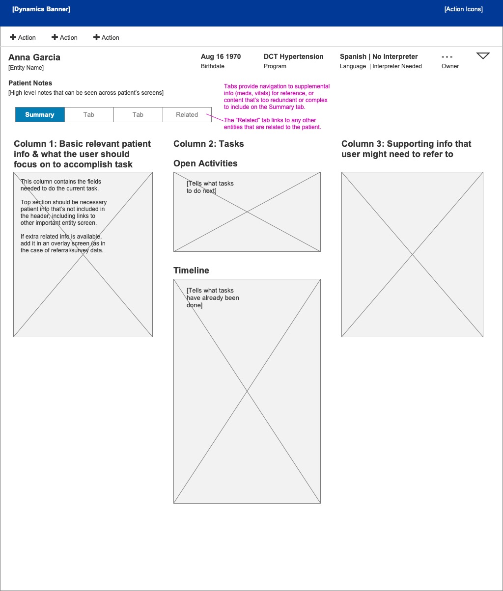
The three-column layout guide: the structural foundation for every screen in the redesigned system.
Design
Screens that guided the journey
With the layout system in place, we wireframed the key screens for each role. The Encounter screen was designed to give navigators an immediate answer to the most important question: what do I do next? Open Activities surfaced the current task at the top, and the Timeline showed what had already been completed so a navigator picking up a patient mid-journey didn’t have to reconstruct the history from scratch.
The Patient Review screen, used by pharmacists for medication review, needed to surface a very different set of information: pertinent medical history, intolerances, the algorithm’s current recommendations, vitals, and labs. We structured it so that the most clinically relevant context was visible without scrolling, and the recommendation workflow sat in a dedicated panel rather than being buried in a list of activities.
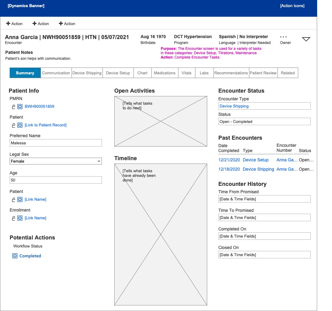
Encounter screen — navigator view
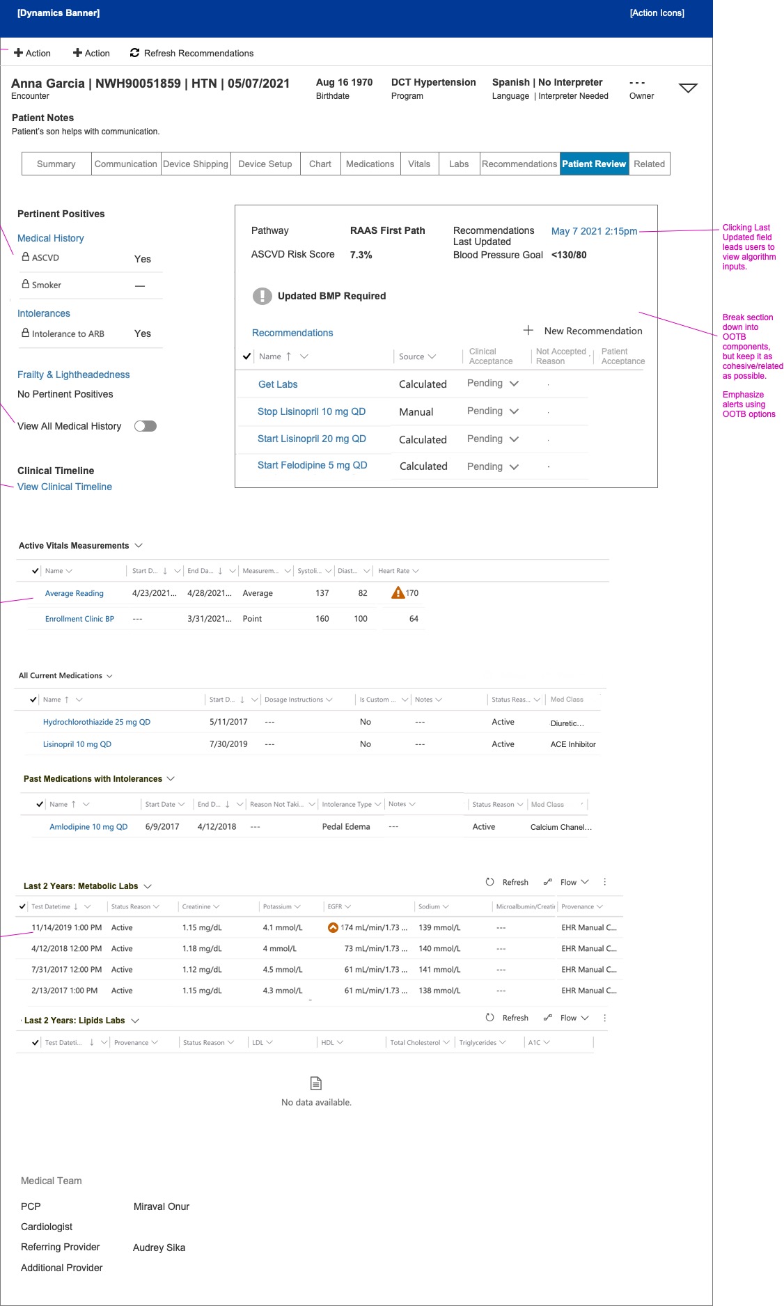
Patient Review screen — pharmacist view
The Encounter and Patient Review screens: two different roles, two different information hierarchies, both within the same structural system.
Reflection
Research as the foundation
Because we were able to take the time to do real research (shadowing people in their actual jobs, cataloguing what was painful and why), we arrived at the design phase with a clear picture of what the system needed to do differently. That picture held up throughout wireframing, workflow specification, and the content work on the message templates.
The automated communications work was particularly instructive. Writing patient-facing messages in plain English and Spanish, tied to specific workflow states, required a level of precision that exposed gaps in the clinical protocols themselves. In that sense, the content strategy did some of the same work as user research: it surfaced what we didn’t yet know, and created the conditions for resolving it before anything was built.
The constraint of working within a platform (Microsoft Dynamics) rather than designing a bespoke interface was also clarifying. The three-column layout system gave us a shared language for every screen in the application, and meant that the decisions we made early in the process remained consistent as the wireframe library grew.