The Project
A brand repositioning
State Street Global Advisors manages nearly four trillion dollars in assets, but research had uncovered a serious gap between the firm’s standing in the market and how it was perceived: low top-of-mind awareness, a fragmented brand story, and trust scores that trailed key competitors. The firm’s message to the marketplace amounted to a long list of products without a clear reason to choose State Street over anyone else.
A firm-wide repositioning effort was already underway, led by a steering committee that included the CEO and executive sponsors. My role was defined in the project’s own language: others were responsible for “the story we need to tell.” I was responsible for “the story our users need to hear.”
The brand story and the user experience weren’t the same problem, and they needed different solutions. My job was to translate the repositioning into a digital platform that institutional investors and ETF buyers around the world could navigate, understand, and use.
“The message to the marketplace is that there are lots of things to buy in the State Street Global Advisors ‘store’ without presenting a consistent and compelling reason why clients and prospects should consider shopping there.”
Where We Started
Two sites, two audiences, no shared story
The existing digital presence had grown organically over years. There was a global institutional site built around “Products & Strategies” and a separate SPDRs (ETF) site, each with its own navigation logic, content model, visual language, and regional variation. Neither told a coherent firm-level story or communicated a unified identity.
The institutional site organized content around product categories. The ETF site had its own separate navigation and brand conventions. Users who worked with both parts of the firm had no clear way to understand how they fit together. And behind the scenes, content teams were managing two parallel publishing operations with no shared infrastructure.

Original global homepage
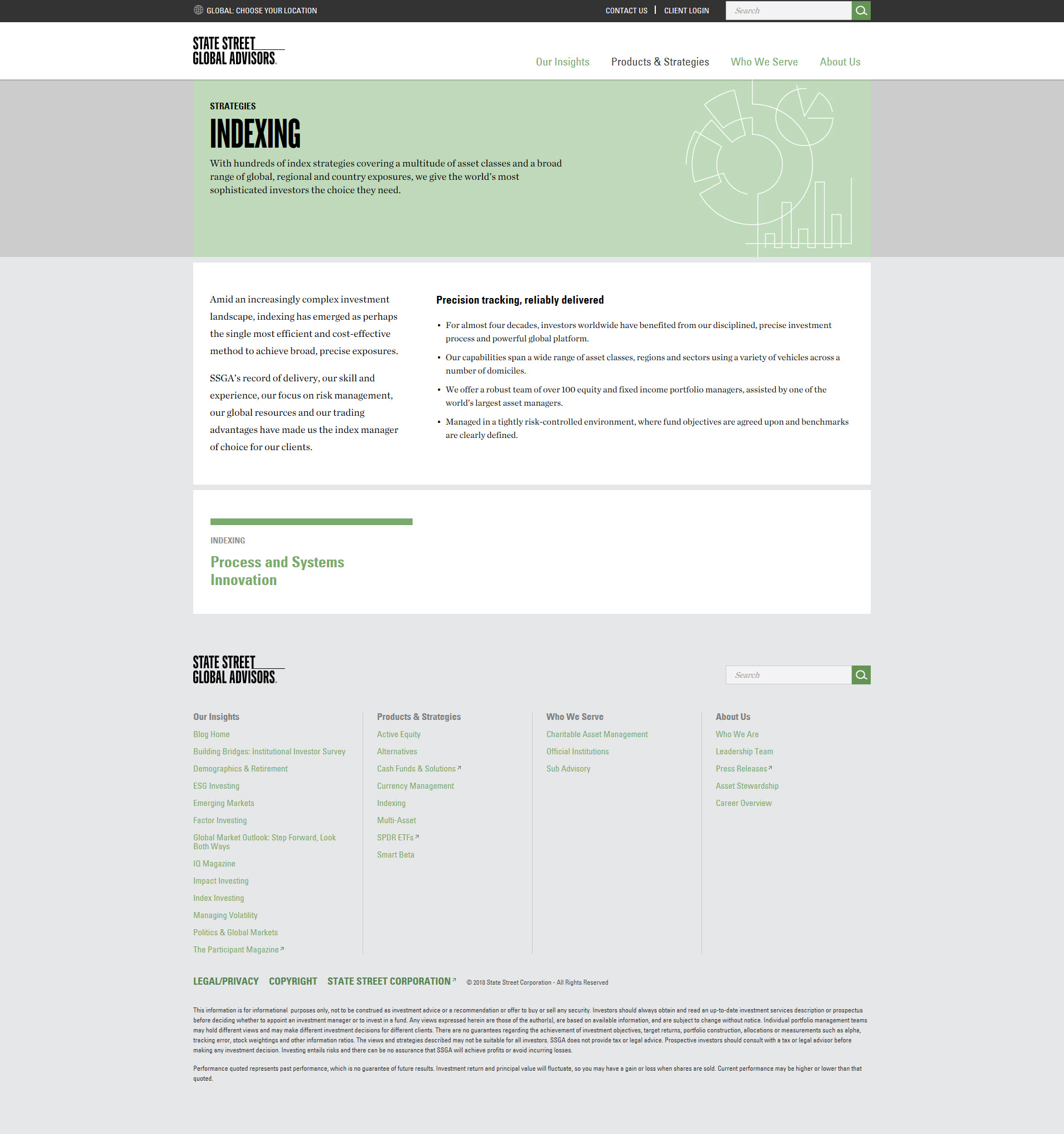
Original strategy page (Indexing)
Original About Us
The original institutional site: product-organized, visually dated, and without a coherent firm-level positioning running through it.
Discovery
Starting with the right questions
Before any navigation model or wireframe, the work began with a working group session to establish what we actually needed to understand. The questions weren’t just about the site structure, but also about the business, the users, and the relationship between the two.
Who are the users exactly? Why do they come to the site? What are they hoping to accomplish? What do we have that they’ll want, and what’s on the site that doesn’t help them? How do these pages get used in marketing? Are we relying on users to find them? How often does content change, and are we prepared to update it?
Getting alignment on those questions first made everything downstream more focused. It also surfaced early disagreements that were better resolved in a working session than during a design review.

Early working session notes: the questions that needed answers before any design decisions could be made.
Stakeholder Management
A high-visibility project with many principals
The governance structure for this project extended from the CEO and executive sponsors through a steering committee of senior investment leaders, to separate core working teams for the institutional and ETF work streams. I was named on both core teams as the UX lead, sitting alongside the brand consultants, digital program leads, content strategists, and specialized subject matter experts from across the firm.
Weekly design reviews were structured around decisions. I coordinated and led working group sessions where we did analysis, definined scope for each initiative, resolved disagreements between departments, and made sure that compliance and legal requirements were factored into design decisions.
The project required presenting to senior leadership at SSGA on a regular cadence. That meant being able to move fluently between detailed design rationale and strategic framing.
Information Architecture
Mapping a combined navigation
The first structural problem was navigation. The two existing sites had incompatible IA models, and the combined platform needed a single structure that could hold both audiences, both product lines, and a unified content strategy without requiring users to understand that a merger had happened at all.
The combined nav planning work started in spreadsheets: mapping every content category from both sites, identifying what was shared, what was audience-specific, and what was genuinely new. The model grouped content into four top-level areas (Products & Strategies, Insights, and About Us) with a dynamic mega-menu layer that could surface investment ideas, featured content, or topic-specific pathways depending on the user’s context.
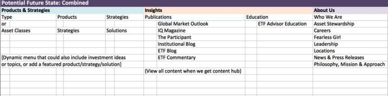
The combined IA mapping: every content category from both sites laid out before a single wireframe was drawn.

L1 and L2 navigation wireframe for the ETF site, with working annotations. The annotation visible in the corner captures a live design decision: “Resources” needed a more concrete label.
User Experience
The self-identification flow: the first decision every user makes
Because the platform served fundamentally different audiences with different content needs and regulatory access, users needed a way to identify themselves at entry. The self-identification flow was a two-step modal: first, the user selects their country and role (Individual Investor, Institutional Investor, or Intermediary); second, they indicate what they’re looking for (ETFs, Institutional Products & Strategies, Cash Funds, or Mutual Funds).
The UX challenge was making this feel welcoming rather than bureaucratic. The regulatory reality was that content had to be gated by role and country, but from the user’s perspective, this needed to feel like personalization, not compliance. The “Not sure? Continue anonymously” option preserved access for users who didn’t want to self-identify, and the “Save this profile as my default” checkbox in step two gave returning users a way to skip the flow entirely.
The self-identification flow did double duty: it routed users to the right content experience, and it was the mechanism by which the platform enforced regulatory content access across 30+ countries, all without surfacing any of that complexity to the user.
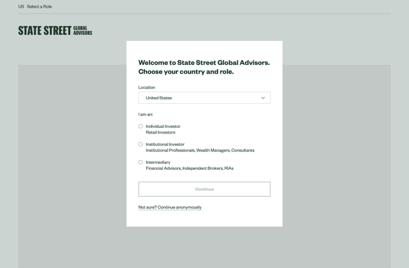
Step 1 — Country & role selection

Step 2 — Product interest & profile save
The two-step self-identification flow: country and role first, then product interest. Compliance logic runs underneath; users experience personalization.
Content Strategy
A unified Insights hub for a fragmented content library
One of the biggest pieces of the brand repositioning was the Insights hub. The existing sites had content scattered across separate publication brands with no unified place to discover it. The combined nav planning work identified Insights as a top-level destination; the wireframe defined what it would actually contain.
The Insights hub wireframe was designed around a filterable content listing: all content, filterable by date, publication, type (podcast, video, article), and author. The design included a left-rail filter panel and a paginated list view, with content labeled by publication so users could scan quickly by format and source.
The working annotations on the wireframe capture decisions still in progress at that stage: should there be sort controls? Search within the page? Showing these questions in the artifact rather than hiding them was a way of keeping the working group honest about what had and hadn’t been decided.

The Insights hub wireframe: all content, unified for the first time, with filters by publication, type, and author. Annotations flag open decisions still being discussed.
Design Systems
A template and component guide for the content team
One of the less visible but practically important deliverables was the template and component guide. As the platform grew to include new page types (hero banners, campaign pages, strategy landing pages, etc.), content authors needed a reference for what was possible and how to use each component correctly.
The guide documented each component with a title, description, recommended character counts for every text field, and visual examples of each layout variant. For the hero banner alone, that meant specifying maximum heading length (40 characters), short description length (105 characters), and CTA button text (20 characters), with examples showing how the component behaved at different text lengths and image configurations.
This work served two audiences at once: it gave content teams a reference they could use without needing to ask a designer, and it gave the visual design and development teams a shared specification to work from. The guide was dated and versioned, with a note on each page about what was available as of that release.
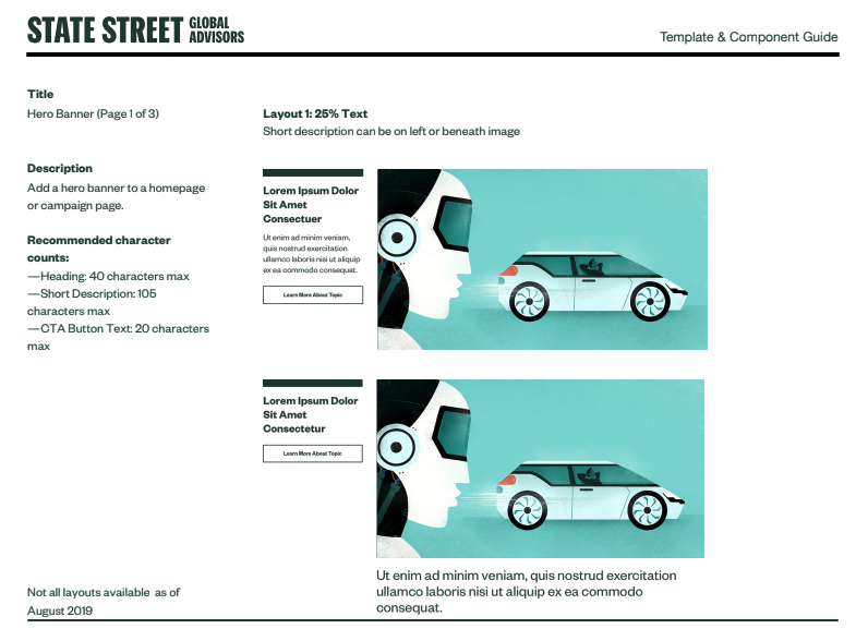
A page from the Template & Component Guide: the Hero Banner component with character count specs and layout variants. Dated August 2019, one of the final deliverables of the engagement.
Final Design
What the platform looked like
The final designs for the institutional site and the ETF Finder reflected the full arc of the work: a unified navigation structure, a clear firm-level identity, and content organized around what users needed rather than how the business was internally organized. Both sites were designed responsively, with mobile experiences that preserved the key functionality of their desktop counterparts rather than stripping it down.
The institutional homepage led with thought leadership and a clear “Our Offerings” section that structured the firm’s capabilities into three legible categories: Strategies, Capabilities, and Products. The ETF Finder gave advisors and institutional buyers a filterable fund search with performance, pricing, listings, and download data—all behind a search bar and a left-rail filter panel that collapsed cleanly on mobile.
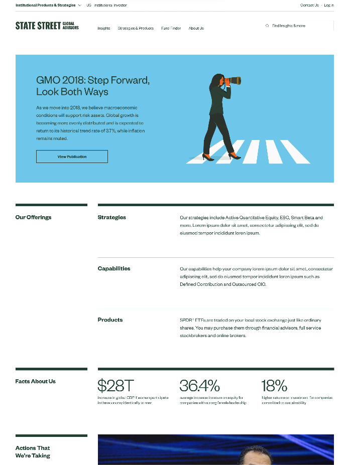
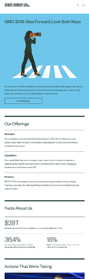
The final institutional site: a firm-level narrative leading into a structured product offering, designed for both desktop and mobile.
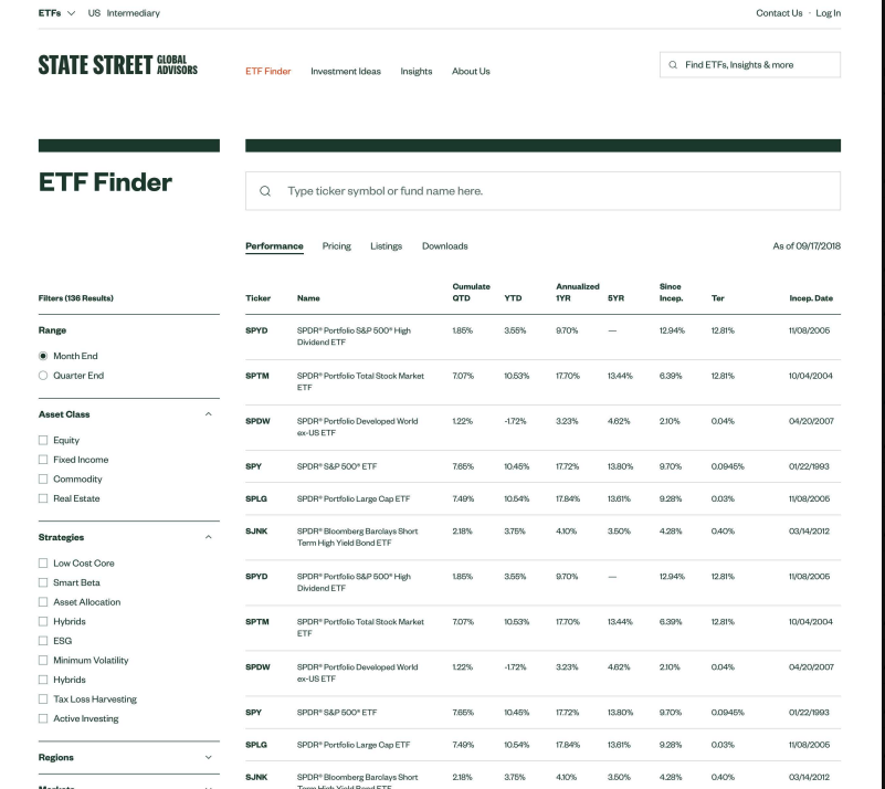
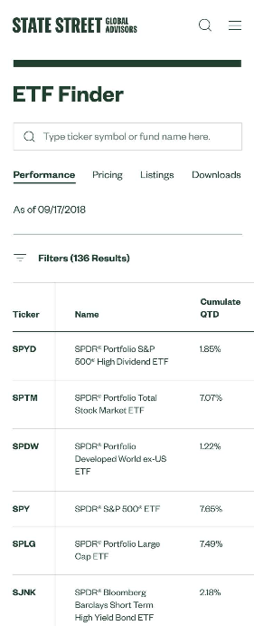
The ETF Finder: a filterable fund search across all results, with performance data, pricing, listings, and downloads. Fully responsive, with filters that collapse cleanly on mobile.
Reflection
The story our users needed to hear
The framing that defined my role on this project ("the story our users need to hear") turned out to be a useful anchor. The brand repositioning effort had done hard and important work to clarify what SSGA stood for. My job was to make sure that story arrived correctly: through a navigation system users could actually orient themselves in, through a self-identification flow that felt like personalization rather than compliance, through content infrastructure that made the right information findable across 30-plus countries.
The stakeholder dimension of this project was as demanding as the design work itself. A steering committee that included the CEO, separate institutional and ETF working teams, compliance, legal, regional business leads, and a world-class external brand consultancy all had legitimate stakes in what the platform became. Managing those relationships was crucial to the project's success.
The most durable lesson was about the gap between what a business wants to say and what users need to hear. Bridging that gap requires understanding both sides well enough to know where they align and where they don’t, and having the standing with stakeholders to build the bridges together.